The Rising Role of Color At Work
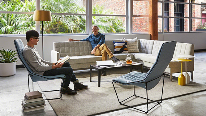
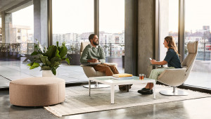
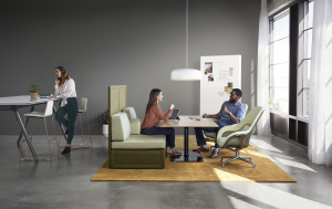
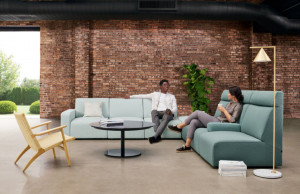
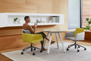
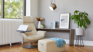
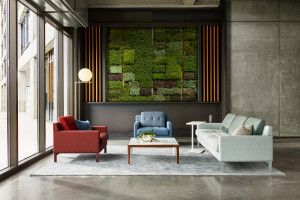
Picture this: looking around the office, you see spaces infused with rich accents – warm, goldenrod yellows, blush pinks, earth and blue tones – it feels residential and exudes a sense of comfort. More and more, forward-thinking organizations are considering the role of color in the office – and for good reason. In this design news aggregate, we explore the rising prominence of color in the larger industry conversation on workplace design and share our point of view on color as well.
Color Matters
Why should we consider color at work? The colors that we see every day in the workplace can impact our overall mental and physical wellbeing. Forbes delves into the science behind this connection, exploring research showing how color affects our brains and our hormones – which then affects our “mood, behavior and our physiology.” HR Dive echoes this sentiment: “the power of color is so strong that those deciding on color for a workspace must use extreme care in putting together a palette to ensure it supports the company’s mission and culture.” In an interview with HR Dive, Associate Director of Drexel University’s Interior Design Program Ada M. Tremonte adds, “Color has the ability to change how people feel…It can calm people, it can bring people together, it can make people excited.”
Putting Color to Work
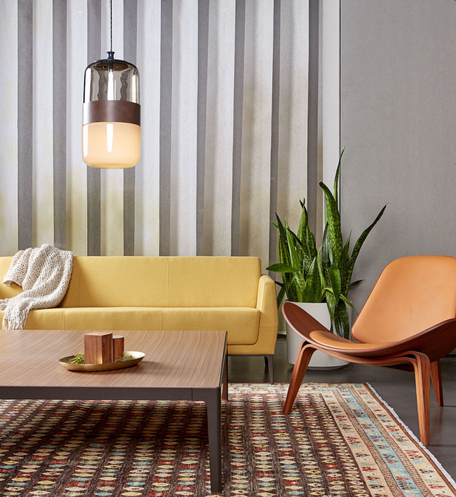
Thrive Global, in a roundup of interior design changes to boost productivity, suggests:
- Blue as a great choice for cognitive tasks.
- Yellow for “creative and innovative workspaces.”
In an interview with HR Dive, Nicole Andreu, senior vice president and design director of commercial interiors at CannonDesign’s New York City office, notes:
- “Red has energy and passion.”
- “Yellow is for happiness.”
- “Green is for growth and stability.”
A thoughtfully-integrated color scheme is one way for the physical space to reflect the company brand. Office Snapshots features the Two Sigma Collision Lab offices in New York City, which include “a palette of earth tones and bright organic colors that play off Two Sigma’s branding.”
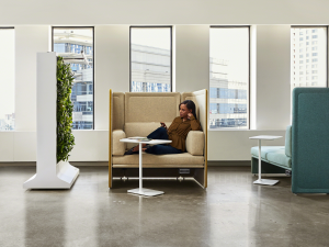
Color can also help differentiate spaces designed for different tasks, including collaborative areas, social settings or environments for personal focus, and it can aid wayfinding in larger offices.
The Coalesse Perspective
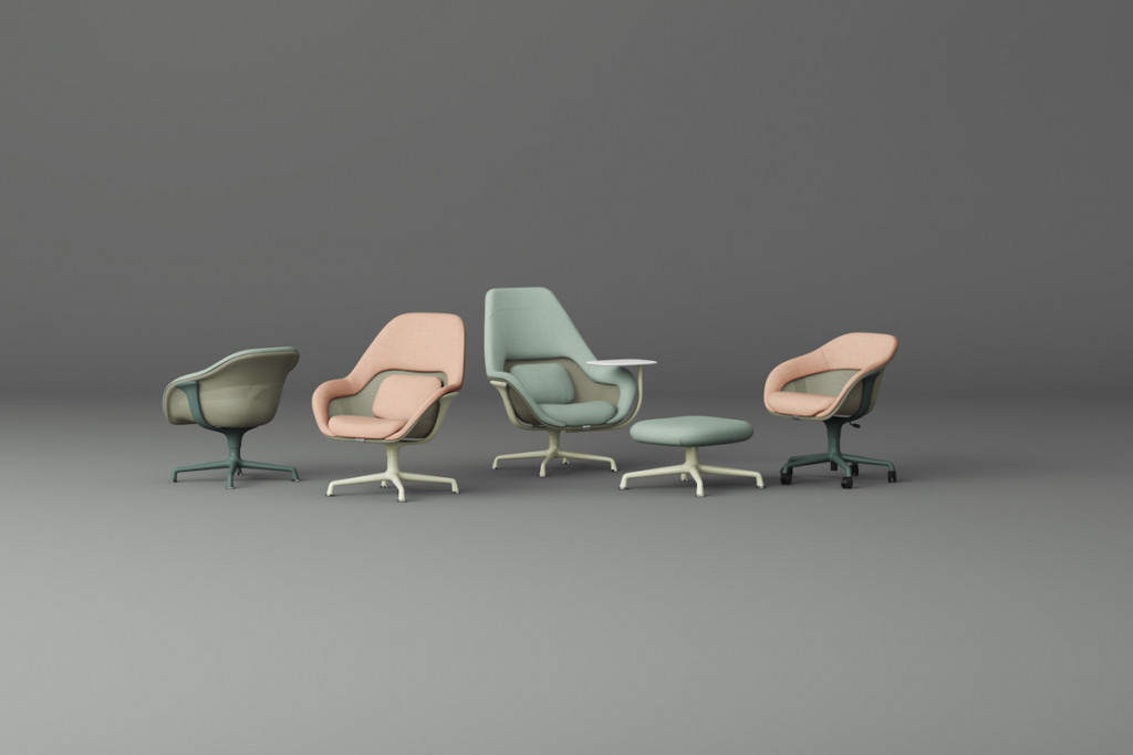
Our point of view is that color shouldn’t be the most important part of any setting. Colors that Coalesse usually uses – and what we’re trying to put forward – are colors that work with a lot of other colors and natural materials.
–John Hamilton, Coalesse Global Director of Design
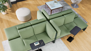
Evaluating how color fits in the overall workplace design is key. We’ve developed the Coalesse color palette; inspired by nature, this is our aesthetic framework that guides our sensibility about color and is designed to suggest a richer residential & environmental spirit in the workplace. Want to learn more about how we approach color? Check out the new and refreshed knit program for SW_1 Seating & Lagunitas Lounge System that’s derived from our color palette, or see how you can customize a selection of our top products with colors of your choice using the Coalesse Customizer.
Incorporating color in the office creates spaces that are more inspiring, more personal and less corporate-feeling – environments that have a more natural warmth & soul. As John Hamilton explains on our blog here, using a fresh palette “…can help you create a space that doesn’t feel like a workplace. It feels like a place you would choose to work.”
How does color play a role in your workplace? Share with us: @coalesse.

