Inspire Workers and Increase Productivity Through Office Color Psychology
If you were to ask workers what they need to do their jobs effectively, odds are, they’ll mention just about everything except the color of their workplace. They’ll talk about the tools they use to do their jobs, and they might name some basic things like desks and chairs. They may even mention what they’re looking for in terms of job benefits. Whether or not workers realize it, the colors of an office design can have a profound effect on productivity and morale.
The concept of color psychology emerged around finding ways to use color to influence people, and the effects of color on moods and productivity are strong and well documented. Although workers might not be able to cite a list of colors that inspire them to do their best work, if a person has ever gone from working in a drab, dull workplace to working in a beautiful, well-designed office, the difference is very noticeable. Neutral colors may be inoffensive, but they aren’t particularly inspiring. Here are a few ideas for how you can use color psychology to increase productivity and motivate people to produce their best work.
Soothing Blue
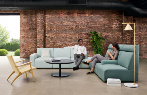
If you mention the color blue, some of the first things people think of are a clear blue sky or a body of water – both things that people tend to associate with feelings of peacefulness. Rooms decorated in blue can have a soothing effect on people. The color is also frequently associated with higher rates of productivity.
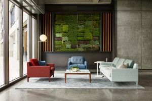
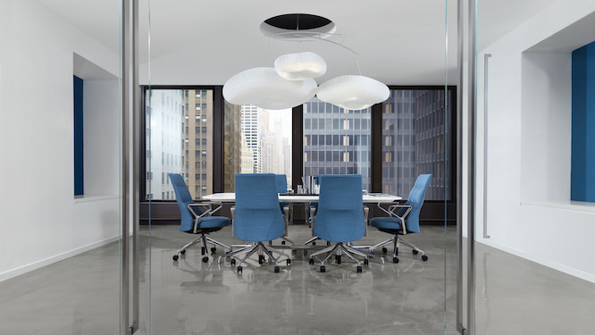
By incorporating blue in a conference room, it’s easier for workers to see conferences and meetings in a more positive light. Our Massaud Conference Seating, pictured above in a soft shade of blue, doesn’t make the room look uncomfortable or intimidating, the way many people expect conference rooms to look. Instead, the room looks like a calm, comfortable place for workers to meet and work together in a low-pressure environment.
Healthy Green
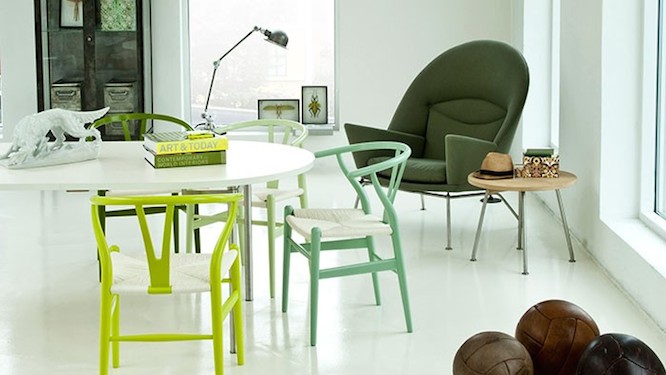
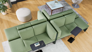
Green is often associated with health, wellness and growth. This makes it a very popular color for hospitals, but it’s also an excellent color choice for offices. It’s a color that doesn’t cause eye fatigue, which makes it perfect for places where workers spend long hours looking at screens. Like the color blue, green also has a calming effect. Since green is commonly associated with nature, incorporating it into an office design helps workers feel rejuvenated and connected to the outside world. Including plants in a design is a popular way to go about this, but introducing the color green through furniture, as pictured above with Carl Hansen & Son CH24 Wishbone chairs and CH468 Oculus chair, can create a similar effect.
Energizing Yellow
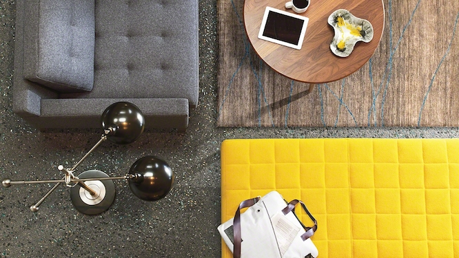
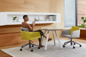
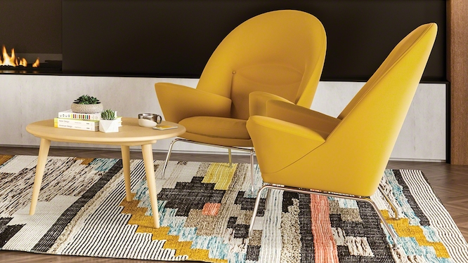
When you mention the color yellow, the first thing many people think of is the sun. It’s cheerful, warm, energizing and typically makes people feel optimistic. A little yellow can go a long way. Adding touches of yellow in certain areas can help inspire creative thinking. Our Millbrae Lifestyle Lounge seating is available in this beautiful, vibrant yellow. Not only is the color extremely inviting and energizing, when it’s used in a lounge area, it creates a perfect place for workers to come together to brainstorm and collaborate in comfort.

