


Creating Brilliant Work. Together.
At Fulton Market Design Days, Coalesse introduced an industry-first interactive installation that brought the power of collective energy and co-creation to life.
Design News
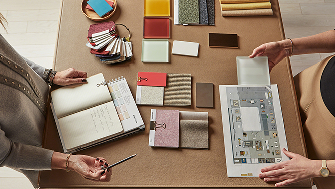
It’s no secret that color can impact how we feel and perceive spaces. By employing effective use of color psychology in office design, we can create spaces that promote different work modes, reduce stress, and make employees feel at home.
Read on to explore the top tips from around the industry for putting color to work in your office.

As Forbes points out, studies have shown colors don’t just change our moods, they can actually impact productivity levels as well. Picking the right color scheme for your workplace is essential for designing spaces that encourage the most effective work modes.
Pantone’s Color of the Year 2020, Classic Blue, is traditionally seen as a relaxing color, but employing different temperatures of blue light can actually make employees feel more comfortable and more energized. Shades of green promote alertness and help combat tiredness, while bright, optimistic yellows are traditionally found in creative workspaces for their noted inspirational effect.
The key to designing effectively, according to K2space is making sure office design teams understand the combination and relationship between the size, intended function, and compositional elements of a given workspace. Red, for example, is noted to foster worker efficiency, but shouldn’t be used in large, open spaces.

One of the top design trends we expect to see in office design this year is the rise of monochromatic color palettes.Dezeen predicts a transition from the stark, Scandinavian modern style of monochromatic design toward a warmer, more tactile iteration that lends itself to workplaces.
Employing a warm palette of similar hues is an effective design tool, especially in smaller offices where excessive color can create a feeling of disorganization. The goal of monochromatic design should be to create a harmonious theme that ties a space together with a clean, cohesive look.
If you’re considering applying a monochromatic style to your office, be sure to start by picking a base color that represents the space to which it will be applied.

As ArchDaily notes, because each color evokes a different emotion, taking advantage of these different psychological impacts can be an effective way to break a workplace into distinct zones. As employees spend less and less time at their desks and more time moving throughout the office, having workspaces that cater to different work modes is essential to productivity.
K2space recommends adopting a strategy that separates these zones with the help of color. Areas intended for creative collaboration and socialization might utilize brighter, more vibrant colors to spark creativity, while zones for quiet concentration should have a more muted, relaxing palette. The modern workplace is a flexible, adaptable space and the color palette of the office should reflect this.
Read more about monochromatic design, choosing hues for your office color palette, and designing with Pantone’s Color of the Year in our blog.


