Coalesse Color Palette: Picturing a Point of View

At Coalesse we are passionate about helping people create spaces where they want to work, not places they have to work.
In order to make the best workplaces, we know it’s essential to reflect a group’s unique sensibilities and to stir emotional engagement—to enliven each person’s wellbeing in a destination that is expressive and welcoming for them. We believe design can help to achieve this, specifically, by creating spaces with greater warmth, vitality and soul. How those spaces and the furnishings in them look and feel to us is as important as how well they perform.
As part of inspiring personal wellbeing, we are committed to offering more creative expression with our products. One of the strongest ways to empower our customers (for both the workplaces they design and the end-users who inhabit them) is through customization — notably, in the categories of design that we can affect with personalized solutions.
We think of our work in this areas through six primary categories of design. Color, pattern and materials are among the most accessible and emotional ways to bring an individualized personality forward in any product. Shape, size and features are addressed as part of our everyday commitment to responsiveness, as we help our customers make furniture that uniquely fits their spaces and needs.
Color is an especially powerful category because it coexists so seamlessly with, on and in virtually every type of material. Everything in the world has color. Everyone responds to color. It can be a principal force that we notice first; it can be subliminal and neutral, present but not loud; it can feel absent. Color can be the most direct, intuitive way of expressing a mood or a culture. Color variations and combinations are virtually limitless.
But all that choice may be overwhelming. Sometimes it is helpful to have a trusted point of view and an informed starting point with a crucial design ingredient like color.
A color palette is this type of edited selection.
Understanding the Coalesse color palette.
Coalesse has developed a specialized framework in the form of a Coalesse color palette, that guides our own sensibility about color. This palette appears through the projects we make and some of the surface material ranges we offer with our products. It informs and can be applied to new collaborations with our partners for other design products, such as fabrics and rugs. We draw from this palette to express a cohesive aesthetic whenever we apply color.
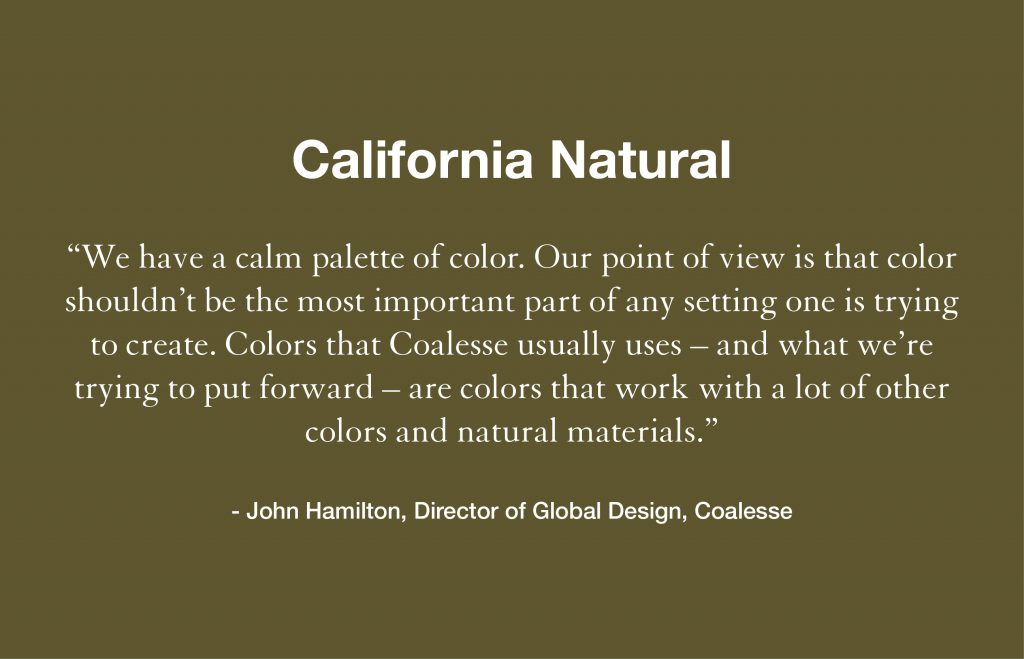
The Coalesse color palette is based on years of refinement and development of this specific perspective—that our colors are a supporting, calming, natural layer of an environment.
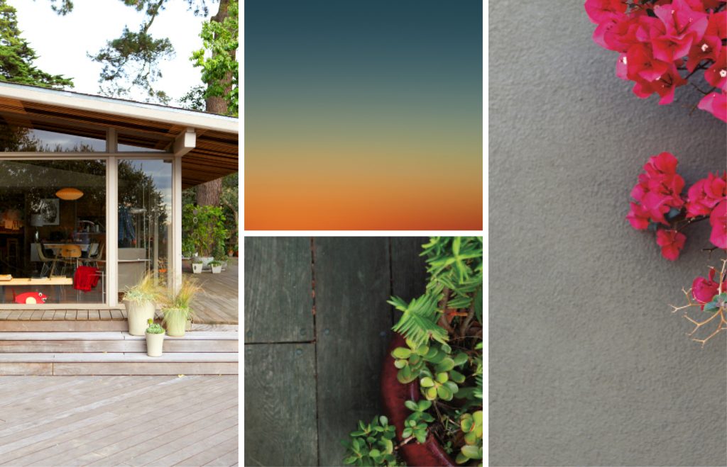
To find these colors, John Hamilton and his Global Design Group looked to nature, for the innate pleasure that natural elements bring to our senses. In particular, the Coalesse color palette is most inspired by California, where the Coalesse design studio was founded and operated for many years. The team drew on the natural environments most directly around them—the presence of both landscape and seascape, and the famed, beautiful, softly colorful light in California—to inform how a unique Coalesse palette would look and feel.
“We wanted the palette to connect with who we are as a brand and how the environment we live in and interact with helps us see things differently. It’s interesting as you move through the world and you experience light in different areas, that the color, the feel of the light is different. The light in a California beach area is different than in the northern territories. But in these places it’s always rich and actually full of color, never flat.”
– John Hamilton
In the palette, there are inspirations from the hues of cactuses and succulents, ocean, sky, wood, and certain flowers and more vivid pollens. The instinctive perception of these colors as being alive and pleasing to be around is known to make people feel welcome, grounded and excited to be a part of an environment.
“I’ve heard people describe our palette as jewel-toned, mineral-y, or light and beach-like. I think it’s interesting that they’d say that because that’s what surrounds us. That’s a lot of what inspired us. It’s a good reflection of who we are that these impressions are coming through in the colors that we’ve chosen.”
– John Hamilton
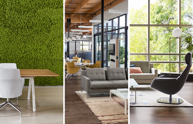
Creating the Coalesse color palette.
The process of defining this palette further involved a long, extensive search into how Coalesse has used color in the past, itself. John Hamilton and his team looked at what had been done over time in the company showrooms, and found a tendency toward a warm, neutral palette in the spaces. The team came to understand that at Coalesse, we use a lot of color, but it’s in a very muted range—rich in tone but low in intensity, and not saturated in the character of strong, vibrant colors.
With that insight, Hamilton and team took the colors they were already using and increased their saturation for more vitality. A new and fresh accent palette was added to the neutral classics, drawing from more vivid shades of the same spectrum. The colors that were chosen for the master Coalesse color palette now have these different saturations in them, so that there are muted versions of the colors and deep, richer versions of those colors.
Working from this natural palette in our aesthetic helps us to meet a more residential personality in workplaces today—an expectation for greater comfort, richness and sophistication in colors, materials, furnishings and forms. Home design has always used color widely to reflect individuality and to create expressive and more varied moods. Our Coalesse color palette is aligned with those sensibilities as we design products and capabilities that give workspaces more warmth, vitality and soul.

